
+86 15073108726

8:00 am - 18:00 pm

info@chromasteel.com

Send us your request

Architectural Design Guide

PVD Stainless Steel for Architectural Projects: Design & Application Guide

Choosing PVD stainless steel for an architectural project is not simply a matter of selecting “Gold,” “Champagne” or “Black.”

The final appearance depends on how the PVD color interacts with the stainless steel surface finish, project lighting, viewing distance, fabrication and the way the material is used within the space. This guide focuses on those design decisions rather than repeating a general explanation of PVD coating technology.

PVD stainless steel applications in elevators retail interiors ceilings and architectural decoration

PVD stainless steel used across different architectural and interior applications.

Core Design Principle

Finish + PVD Color + Lighting + Application + Fabrication determine the final architectural appearance.

Before You Specify the Material

PVD Stainless Steel Should Be Selected as a Complete Surface System

In architectural interiors, two stainless steel panels described with the same PVD color can look noticeably different. A champagne gold mirror panel creates strong reflections and visual contrast, while a champagne gold hairline or bead blasted panel produces a softer and more controlled metallic appearance.

This is why architects and designers should avoid specifying only a color such as “Gold PVD Stainless Steel.” The base surface finish, lighting environment, panel dimensions, touch frequency and fabrication requirements should be considered together before the final material is approved.

The sections below focus on practical architectural decisions: how different finishes change the visual result, which combinations are commonly considered for elevators, hotels, retail spaces and wall cladding, how lighting affects metallic colors, and what should be checked before approving a project sample.

Surface Finish
PVD Color
Lighting
Application
Fabrication

Looking for the technical explanation of Physical Vapor Deposition itself? We keep the coating technology and production details in a separate guide so this article can stay focused on architectural specification and design.

Read What Is PVD Stainless Steel
Step 1 — Surface Selection

Start With the Surface Finish, Not the PVD Color

Before choosing gold, champagne, bronze or black, decide how you want the metal surface to interact with light. The base finish controls reflection, texture and visual movement, while the PVD coating adds the metallic color.

Ask This Question First

Do you want the stainless steel to create a strong mirror reflection, a controlled directional grain, a softer satin appearance or a matte architectural texture? Once that decision is clear, the PVD color becomes much easier to select.

Mirror + PVD

High Reflection

Mirror-polished stainless steel produces the strongest reflections and makes the PVD color appear bright and visually dominant. Surrounding lights, furniture and people can all become part of the reflected surface.

Reflection Very High
Visual Impact Strong
Common Starting Applications

Luxury elevator interiors · Retail features · Decorative panels · Reception details
Hairline + PVD

Directional

Hairline stainless steel has a fine continuous directional grain. It produces a more controlled metallic reflection than mirror finish while keeping the surface clearly recognizable as architectural metal.

Reflection Moderate
Visual Character Clean & Linear
Common Starting Applications

Elevator doors · Wall panels · Hotel interiors · Door frames · Commercial metalwork

Brushed / Satin + PVD

Soft Linear

Brushed and satin finishes create a softer directional metallic appearance. Compared with a fine hairline finish, the exact grain and reflection can vary depending on the selected brushing process and approved reference sample.

Reflection Low to Moderate
Visual Character Soft & Controlled
Common Starting Applications

Large wall surfaces · Interior trims · Columns · Commercial architectural details

Bead Blasted + PVD

Matte

Bead blasted stainless steel diffuses reflected light and creates a soft matte metallic surface. Champagne, bronze and other restrained PVD colors can appear particularly subtle on this type of finish.

Reflection Low
Visual Character Matte & Refined
Common Starting Applications

Hotel lobbies · Reception backgrounds · Wall cladding · Columns · High-end interior details

Etched or Textured + PVD

Decorative

Etched, embossed and other textured stainless steel surfaces add pattern or three-dimensional character before the PVD color is applied. These finishes are normally selected when the metal itself needs to become a stronger decorative feature.

Common Starting Applications

Elevator feature panels · Luxury retail details · Hotel feature surfaces · Decorative doors · Custom architectural panels

A Simple Way to Narrow Down the Finish

If You Want Strong Reflection

Start by reviewing Mirror + PVD samples.

If You Want Controlled Metallic Grain

Start with Hairline or Brushed + PVD.

If You Want Soft Low-Glare Metal

Consider Bead Blasted + PVD.

If You Want Strong Decorative Texture

Review Etched, Embossed or textured PVD options.

Step 2 — Application Selection

How to Choose PVD Stainless Steel by Application

The best starting finish depends on what the metal needs to do visually and how people interact with it. Reflection, touch frequency, viewing distance, lighting and panel size can all influence the choice.

Use the Application as a Starting Point, Not a Fixed Rule

The combinations below are practical starting directions for design discussion. Final selection should still be confirmed with actual finish and color samples under conditions similar to the completed project.

Application 01

Elevator Interiors

Common Starting Finishes Hairline / Mirror / Etched + PVD

Hairline provides a controlled linear appearance, mirror can create stronger visual impact, while etched surfaces are useful when the elevator requires a more decorative panel design.

Main Design Considerations

Consider touch frequency, fingerprints, lighting reflection, panel joints and how the finish will continue across doors, frames and cab-wall components.

Touch Reflection Panel Alignment
Application 02

Hotel & Hospitality

Common Starting Finishes Hairline / Brushed / Bead Blasted + PVD

These finishes can create a more controlled metallic effect than a full mirror surface. Champagne gold, bronze and other warmer tones are often explored when the design calls for a softer architectural metal presence.

Main Design Considerations

Hotel lighting strongly affects metallic color. Check samples next to stone, wood, glass and other adjacent materials under lighting similar to the final lobby or guest-area environment.

Warm Lighting Material Matching Low Glare
Application 03

Retail & Showrooms

Common Starting Finishes Mirror / Hairline / Decorative Textured + PVD

Mirror surfaces can provide stronger visual impact for feature areas, while hairline or textured finishes may be more appropriate where the metal acts as a supporting architectural material around products and displays.

Main Design Considerations

Consider whether the metal should become a visual focal point or remain secondary to merchandise. Store lighting and surrounding reflective materials can significantly change the final effect.

Visual Impact Display Lighting Brand Palette
Application 04

Wall Cladding & Columns

Common Starting Finishes Hairline / Brushed / Bead Blasted + PVD

Large architectural surfaces often benefit from more controlled reflection. Hairline, brushed and matte finishes can make the metal read as a continuous architectural material rather than a mirror-like decorative object.

Main Design Considerations

Panel size, joint layout, grain direction, flatness and lighting should be reviewed together. Large areas also make finish and color consistency more visually important.

Panel Joints Grain Direction Consistency
Application 05

Ceilings & Overhead Features

Common Starting Finishes Mirror / Textured / Brushed + PVD

Mirror finishes can amplify light and surrounding architecture, while brushed or textured surfaces can create a more controlled overhead feature with less direct reflection.

Main Design Considerations

Evaluate fixture reflections, viewing distance, panel module, maintenance access and how the ceiling surface interacts with the overall lighting design.

Lighting Viewing Distance Panel Module

Quick Starting-Point Guide

Use this only to narrow the options before reviewing real samples.

High Visual Impact Mirror + PVD
Controlled Architectural Look Hairline / Brushed + PVD
Soft Matte Appearance Bead Blasted + PVD
Decorative Feature Surface Etched / Textured + PVD
Important: application type alone should not determine the final stainless steel specification. Grade, thickness, panel construction, fabrication, fixing method, environment and maintenance requirements should also be reviewed for the actual project.
Step 3 — Lighting

How Lighting Changes PVD Stainless Steel

Metallic PVD finishes do not have one fixed visual appearance. The perceived color changes with light temperature, intensity, reflection and viewing angle, so lighting should be considered before the final surface is approved.

The Same PVD Color Can Look Very Different in Different Spaces

A champagne gold panel under warm hotel lighting can appear richer and softer than the same general metallic color under cooler commercial lighting. Highly reflective finishes amplify the surrounding light, objects and materials even further.

01

Warm Lighting

Warm interior lighting generally reinforces the warm visual character of gold, champagne, bronze and copper-toned PVD surfaces.

Design Consideration

Often useful to review for hotel lobbies, restaurants, hospitality spaces and interiors using warm stone or timber.

02

Neutral Light & Daylight

Neutral lighting can make it easier to compare the general metallic tone of samples without the stronger warming or cooling effect of some interior lighting.

Design Consideration

Useful during initial material comparison, but final approval should still be made under project-relevant lighting.

03

Cool Lighting

Cooler lighting can make warm metallic colors appear more neutral and can increase visual contrast with timber, stone and other warmer interior materials.

Design Consideration

Often relevant in retail, office and commercial interiors using cooler architectural lighting.

Champagne gold PVD stainless steel in a luxury hotel interior under warm architectural lighting
Hospitality Example

Champagne Gold in Warm Hotel Lighting

Warm lighting and surrounding materials such as stone and timber can reinforce the softer, warmer character of champagne gold. Hairline, brushed or matte surfaces generally create more controlled reflection than mirror-polished stainless steel.

See a matte example in our Champagne Gold Bead Blasted Stainless Steel product page.

Gold mirror PVD stainless steel used in a luxury retail store interior
Retail Example

Gold Mirror Under Retail Lighting

Mirror-polished PVD stainless steel reacts much more strongly to architectural lighting. Display lights, merchandise, glass and surrounding surfaces become part of the reflection, creating a brighter and more visually active metallic surface.

If the metal is intended to become a strong feature, this level of reflection can be useful. If the design needs a quieter metallic presence, hairline or brushed PVD may be a better starting point.

See the actual finish in our Gold Mirror Stainless Steel Sheet product page.

Surface Finish Changes How Lighting Is Perceived

Lighting and PVD color cannot be evaluated separately from the stainless steel surface underneath.

Mirror Finish Reflects the Environment

Strongly reflects fixtures, adjacent materials and movement, creating the most dynamic response to lighting.

Hairline / Brushed Directional Reflection

Light follows the directional grain, producing a more controlled architectural metallic appearance.

Bead Blasted Diffused Reflection

Scatters reflected light across a matte surface and reduces the strong reflections associated with polished metal.

Review PVD Stainless Steel With the Surrounding Materials

Metallic finishes should ideally be checked next to the actual stone, marble, timber, glass or painted surfaces planned for the project. The surrounding palette affects how warm, dark or reflective the stainless steel feels within the finished space.

Best Practice: Approve the Sample Under Similar Project Lighting

For projects where metallic color is visually important, review the physical sample under lighting conditions as close as practical to the completed environment.

Selected Base Finish Final PVD Color Project Lighting Adjacent Materials Different Viewing Angles
Step 4 — Color Selection

How to Choose PVD Colors for Interior Design

PVD color should support the architectural mood of the space rather than function as an isolated decorative decision. Gold, champagne gold, bronze, rose gold and black each create a different visual tone, especially when combined with different finishes, lighting and adjacent materials.

Color Creates Mood, Finish Changes Expression

A strong gold mirror surface can feel bold and highly visible in a retail or elevator environment, while a softer champagne gold bead blasted or hairline surface can appear much more restrained in a hotel or hospitality space. The goal is not only to choose the right color, but also to decide how that color should behave within the interior.

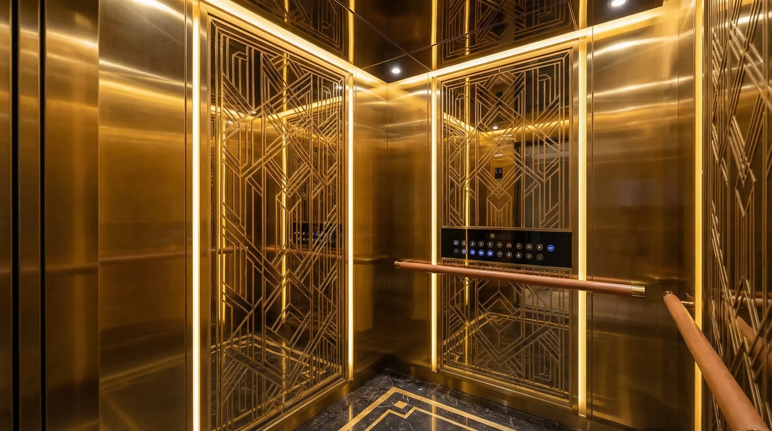
Gold PVD stainless steel used in an elevator interior
Color Direction

Gold

Gold is the most direct and visually assertive metallic option. It is often considered when the stainless steel is intended to feel luxurious, high-visibility and clearly decorative.

Visual Character Bold · Luxurious · High Contrast
Often Paired With Marble · Glass · Dark Wood · Accent Lighting
Common Starting Applications Elevators · Retail Features · Decorative Panels
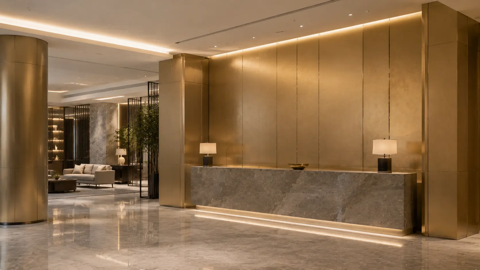
Champagne gold stainless steel in a luxury hotel interior
Color Direction

Champagne Gold

Champagne gold is usually perceived as a softer and more restrained alternative to bright gold. It works well when the project calls for warmth and elegance without the stronger visual impact of a highly reflective gold surface.

Visual Character Warm · Refined · Controlled
Often Paired With Stone · Timber · Warm Marble · Soft Lighting
Common Starting Applications Hotel Lobbies · Reception Areas · Wall Features
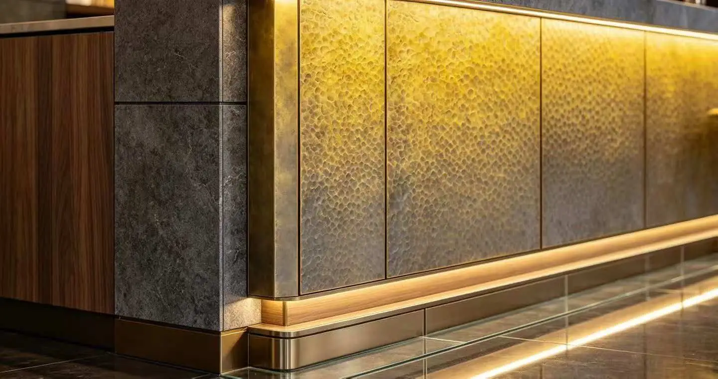
Bronze-toned decorative stainless steel used as an architectural feature surface
Color Direction

Bronze

Bronze generally feels warmer, deeper and more grounded than bright gold. It is often considered when the interior needs a richer metallic tone that integrates naturally with timber, stone and other warm architectural materials.

Visual Character Warm · Mature · Grounded
Often Paired With Walnut · Travertine · Beige Stone · Textured Surfaces
Common Starting Applications Feature Walls · Hospitality Interiors · Accent Metalwork
Design Direction Textured or lower-gloss surfaces often make bronze feel richer and more architectural.
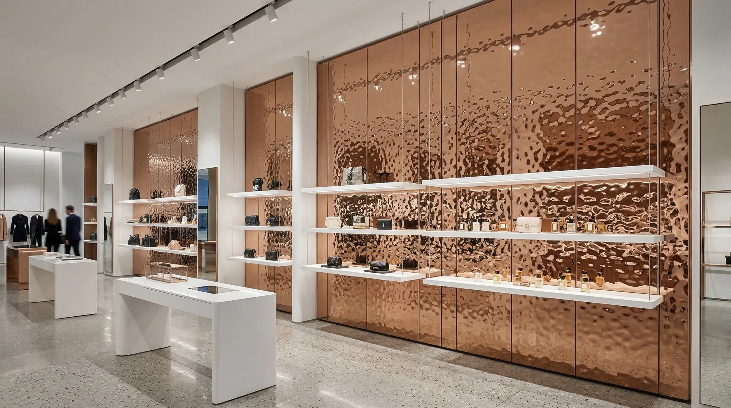
Rose gold decorative stainless steel feature wall in a retail interior
Color Direction

Rose Gold

Rose gold has a softer and more decorative personality than standard gold. It can feel more fashion-oriented and distinctive, especially in boutique retail, feature walls and interiors where the metal surface is intended to become a visual highlight.

Visual Character Decorative · Soft · Boutique-Oriented
Often Paired With Glass · Soft Stone · Cream Tones · Accent Lighting
Common Starting Applications Retail Features · Decorative Walls · Reception Areas
Design Direction Patterned or textured surfaces can make rose gold more expressive.

What About Black PVD?

Black PVD is often chosen when the design calls for a more contemporary, graphic or high-contrast metal appearance. Compared with warm metallic colors, black tends to feel sharper and more architectural, especially when paired with stone, glass, concrete or monochrome interior palettes.

Black can become very dramatic on mirror surfaces and much more controlled on hairline, brushed or matte finishes. For this reason, finish selection is particularly important when specifying black decorative stainless steel.

The Same Color Can Feel Completely Different on Different Finishes

A gold mirror panel and a gold hairline panel do not communicate the same architectural mood, even when the general PVD color family is similar. Mirror makes the color feel brighter and more active. Hairline and brushed finishes make it more directional and controlled. Matte finishes can make the same color appear softer and less reflective.

This is why color should not be specified alone. A practical specification normally requires the complete combination of stainless steel grade, surface finish, PVD color, panel dimensions and sample approval.

Best Practice: Approve the Actual Finish + Color Combination

For architectural projects, do not approve metallic color only by name or from a photo. Review the actual base finish and PVD color together, ideally under lighting conditions similar to the final project environment.

Step 5 — Specification

Common PVD Stainless Steel Specification Mistakes

Many project problems begin before production. Incomplete finish descriptions, color approval from digital images and missing fabrication details can all create differences between the intended design and the finished installation.

A Color Name Is Not a Complete Material Specification

Architectural PVD stainless steel should be specified as a complete material system. The stainless steel grade, base finish, PVD color, dimensions, fabrication and approved reference should all be clear before production begins.

01

Specifying Only “Gold PVD Stainless Steel”

“Gold PVD” does not define the surface finish. Gold mirror, gold hairline and gold bead blasted stainless steel can look completely different even when the general metallic color is similar.

Too Vague Gold PVD Stainless Steel
Better 304 Stainless Steel · Hairline Finish · Gold PVD
02

Approving the Color From a Phone Photo

Phone cameras, screen brightness, white balance and image processing can all change the apparent color of metallic stainless steel. Digital images are useful for narrowing options, but they should not be the only approval reference for a color-sensitive project.

Risk Final approval based only on a WhatsApp or email image
Better Approve a physical finish + color sample before production
03

Ignoring the Final Lighting Environment

Metallic color can change visually under warm, neutral or cool lighting. A sample approved under office lighting may appear different after installation in a hotel lobby, retail store or other project environment.

Risk Approve the sample without considering project lighting
Better Review the sample under lighting similar to the final space
04

Forgetting Grain Direction and Panel Joints

Directional finishes such as hairline or brushed stainless steel should be coordinated across adjacent panels. Changing grain direction can create an obvious visual difference even when the material and PVD color are otherwise the same.

Risk Panels installed with inconsistent grain direction
Better Define panel layout and grain direction in the drawing
05

Treating Fabrication as a Separate Decision

Cutting, bending, welding, panel construction and edge details can influence how a decorative surface is handled and protected. Fabrication requirements should therefore be discussed before material production, not only after finished sheets arrive.

Risk Select the decorative sheet first and consider fabrication later
Better Send drawings and fabrication requirements before production
06

Ordering Later Project Phases Without a Reference Sample

If a project is supplied in several stages, the approved finish and color reference should be retained. Later production should be compared against the agreed physical reference rather than relying only on the original color name.

Risk Reorder months later using only “same champagne gold”
Better Retain the approved sample and production reference

Before You Approve the Final PVD Specification

Stainless Steel Grade
Thickness
Base Surface Finish
PVD Color
Panel Dimensions
Grain Direction
Fabrication Details
Approved Physical Sample
Step 6 — Final Approval

What to Check Before Final PVD Stainless Steel Approval

Once the design direction is selected, the final step is to turn that concept into a clear production reference. The goal is to make sure the designer, contractor and supplier are approving the same material before mass production begins.

Move From Design Intent to a Production Reference

A mood board or rendering can communicate the architectural direction, but production requires a more specific reference. Final approval should connect the visual design with the actual stainless steel finish, physical sample, panel layout and fabrication requirements.

01

Confirm the Design Direction

Decide whether the project requires a highly reflective, directional, matte or textured metallic surface, then narrow the PVD color family.

Surface Character PVD Color Application
02

Review a Physical Material Sample

Evaluate the actual finish and PVD color together rather than approving them separately. Where possible, review the sample next to surrounding architectural materials and under similar lighting.

Physical Sample Project Lighting Adjacent Materials
03

Confirm Panel Layout & Fabrication

Review panel dimensions, grain direction, joints, cutting, bending and any fabricated details before final production. Directional finishes should be coordinated across adjacent panels.

Panel Size Grain Direction Joints Fabrication Drawing
04

Confirm the Material Specification

The production document should identify the stainless steel grade, thickness, dimensions, base finish, PVD color and other treatments required for the project.

Grade Thickness Base Finish PVD Color Protective Film
05

Keep the Approved Reference for Production

Retain the approved physical sample and project reference, especially when the project will be supplied in several stages. Future batches can then be evaluated against the same agreed visual reference.

Approved Sample Project Reference Batch Planning

Keep One Clear Approved Reference

For color-sensitive architectural projects, a physical sample should remain the primary visual reference for the agreed finish and PVD color. Renderings, photographs and digital color references can support the discussion, but they should not replace the approved material sample.

Ready to Review a PVD Finish for Your Project?

Send your finish direction, reference images, drawings or material schedule and compare the available PVD stainless steel options.

Send Project Details
Continue Your Research

Related PVD Stainless Steel Resources

Use the resources below when you need commercial specifications, coating information, broader interior-design guidance or a closer look at a specific reflective PVD finish.

Final Design Takeaway

PVD stainless steel should not be selected by color alone. The most successful architectural specifications consider surface finish, PVD color, lighting, application, fabrication and physical sample approval as one complete decision. Define the visual intent first, then confirm it with the actual material before production.

Architectural Project Support

Need Help Selecting a PVD Finish for Your Project?

Send your design reference, drawings, preferred color or project application. You can compare real finish samples before confirming the final PVD stainless steel specification.

Physical finish and color approval is recommended for color-sensitive architectural projects.

Inquiry Now

Share your idea, We’ll find solution for you within 12 hours.